The maps we use have an effect on the way we understand the world that surrounds us. Since maps tend to be formed in an identical way – Europe in the centre and everything else revolving around it- some entirely different ones may challenge our permanent understanding.
Map 1
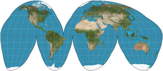
This map shows that the one we’re used to seing is actually quite inaccurate. The Earth has three dimensions and when we try to represent it on two, on paper, dimensions are altered. Areas that are far away for the equator look bigger than they are, for this reason. This map sets some things straight…
Map 2
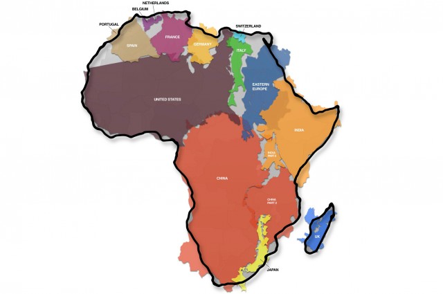
This map shows that Africa is actually quite bigger than we may think! This one continent can fit inside it the US, the pretty big country of China, and quite a lot of other countries. Doesn’t look like it, does it?
Map 3

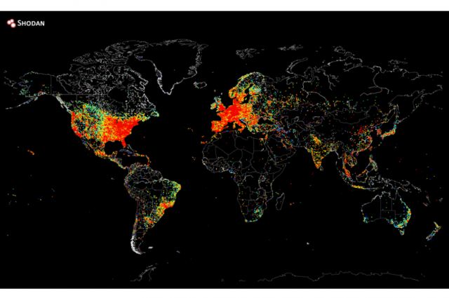
This map shows internet junkies! It shows where the most people connected to the internet are gathered. As you may have already imagined, the redder the area is, the more people are connected. US and Europe, you may have a problem.
Map 4
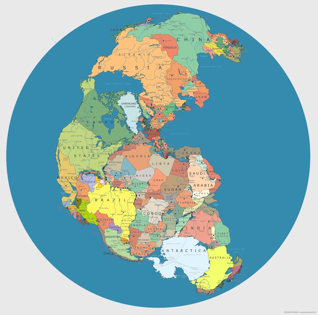
This shows how modern day nation borders would look in the prehistoric world: it is a map of Pangea, the supercontinent that started breaking off 200 million years ago, as researchers have concluded, to start forming the world as we know it today. Why do we need so many borders?
Map 5
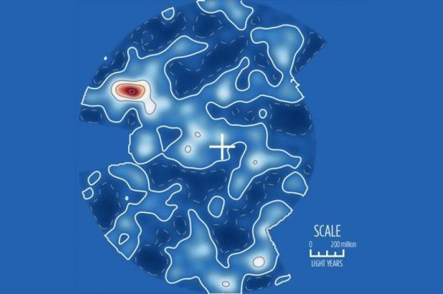
On this map, Earth might look a little small. This is a map of Kosmos as we know it so far. It shows presence of galaxies in light blue, with white showing a greater concentration of them. The red shows a supercluster of galaxies. In blue, are the areas we know nothing about. (Yet).
By Jonah Winter, Truth Inside Of You

