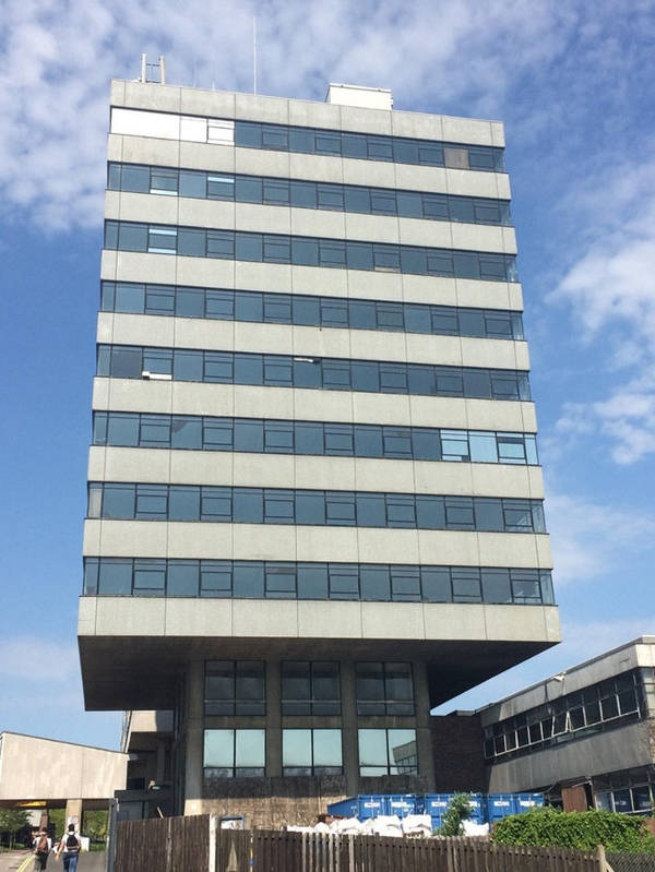
All over the world, architects have often done wonders and have made people marvel at their magnificent buildings. Some of these state-of-the-art buildings have truly been expressions of immense creativity and technical skill. However, the field of architecture is not all good. Probably, there have been more design fails than there have been good ones. Many a time, buildings have even collapsed due to faults in their designs.
Now, bad is one thing and might also be tackled in different ways. Sometimes, it has been worse than bad because the designs have been utterly meaningless.
In this article, let us take a look at some weird architectural design fails that would leave you laughing or cursing the designer:
Reverse arrangement
I’m sure the architect was a backbencher and did not study at all. Or, maybe, he simply couldn’t understand what the correct way to hold his design sketch was. I cannot imagine any other reason why someone would make a reverse design like this one.
Making life difficult
Surely the architect had forgotten that he was designing a barber shop where hairs would be lying around. Now that it’s done, the workers are the sole sufferers. Just imagine how much extra work they have to do each day only because of this stupidity.
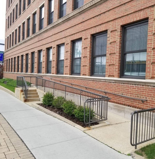
Just like that!
I don’t know why anyone would make such a ramp and a staircase which take you nowhere. I think the designer was unaware of what he/she was trying to do. They simply put these things in, just like that!
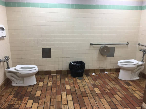
Missed the wall in between
Surely, there was supposed to be a wall in the middle. Yet, unfortunately, the architect forgot to draw the same and this was the effect. Plus, the toilet paper roll is only on one side and that’s even weirder.
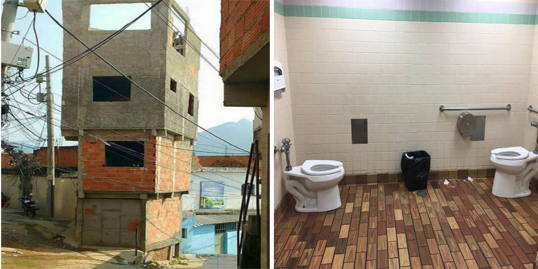
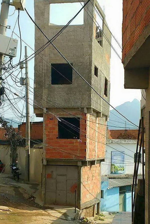
Extension
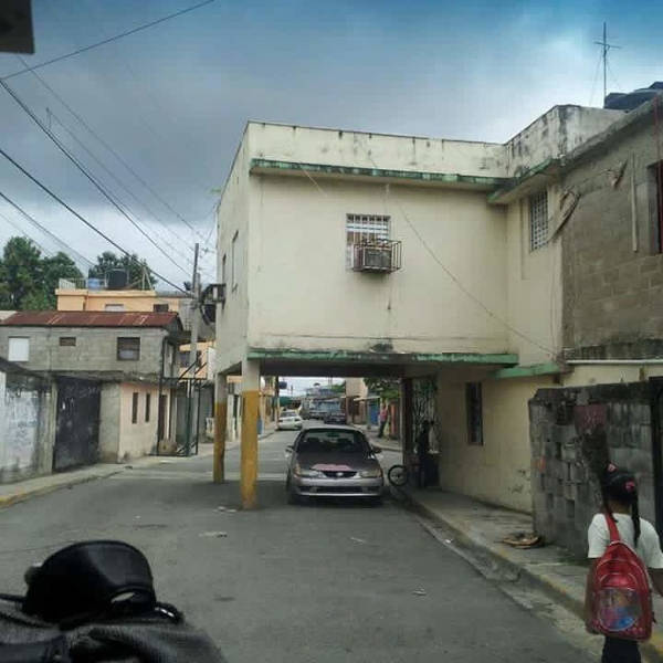
Extending a house to accommodate more people is not very uncommon. Yet, this is probably the only time someone thought of doing it this way. This one renders me speechless indeed.
A meaningless door
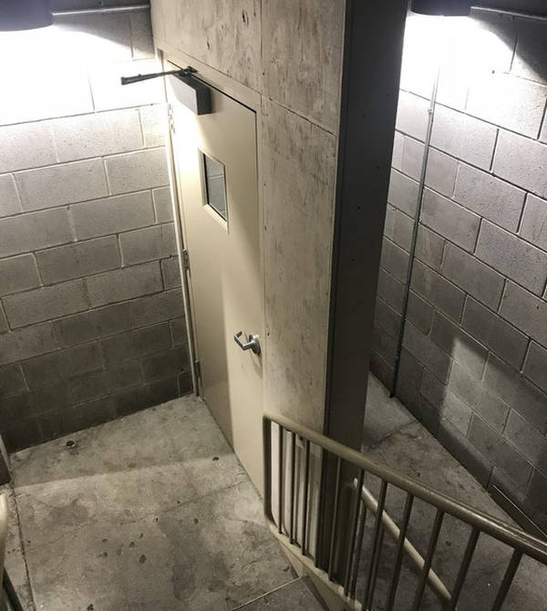
A door is a door only when it’s on a complete wall or something like that. I think this architect just wanted to show that he can design a door and so he did. It didn’t matter if the door was even relevant or not.
Miscalculation
The idea of this design could have been great, if only it would have been placed correctly.
Waste segregation?
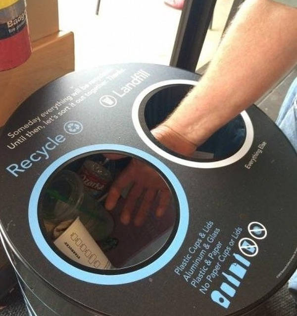
I must say that this is an absolutely worthless trash can. I mean what’s the point of this design if it cannot actually keep things separately.
Stairway to hell
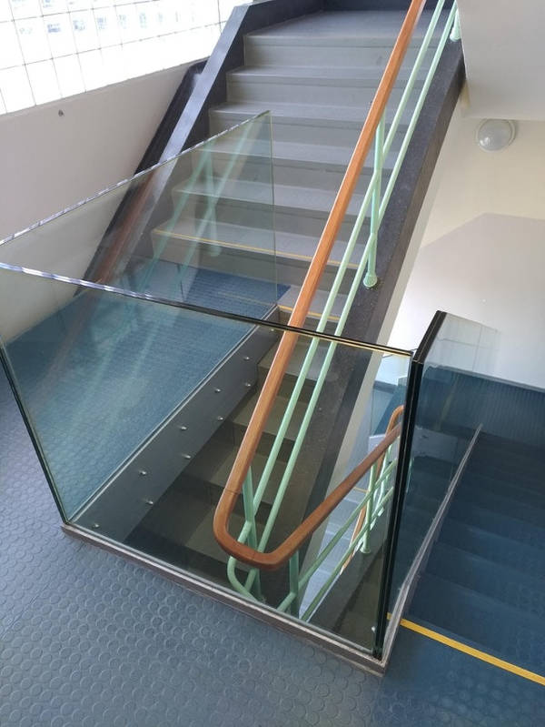
I think the designer carved out a narrow strip of a staircase so that people could go straight to hell on that one. I don’t see any other reason for making such a thing.
Failed in physics
I’m sure this designer flunked all his physics tests at school. Otherwise, he would have had the basic sense to not make something as dangerous as this one.

